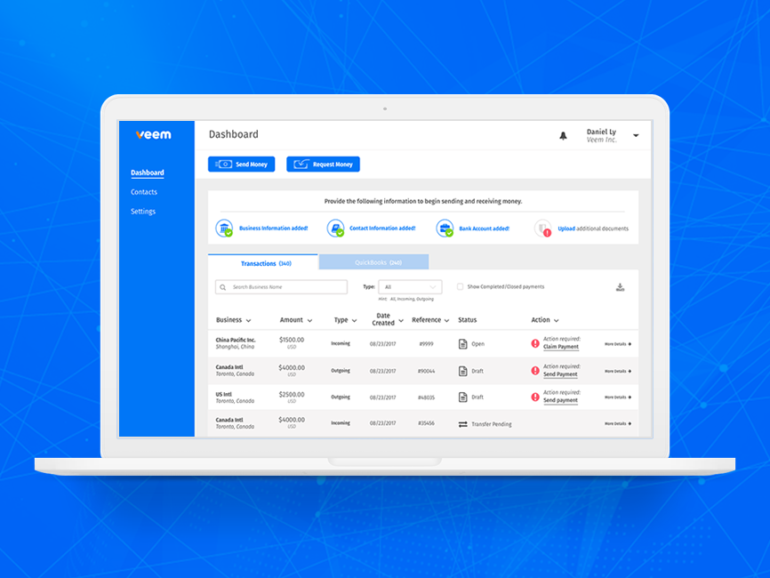
The old 'send payment' process
The requirements
• Reduce the amount of steps in the process
• Add communication of progression
• Re-organize user input fields so it makes more sense
• Reduce the amount of user input fields if possible
• Reduce the overwhelmingness
• Provide the information on why we need specific pieces of information
• Add widgets where possible or APIs
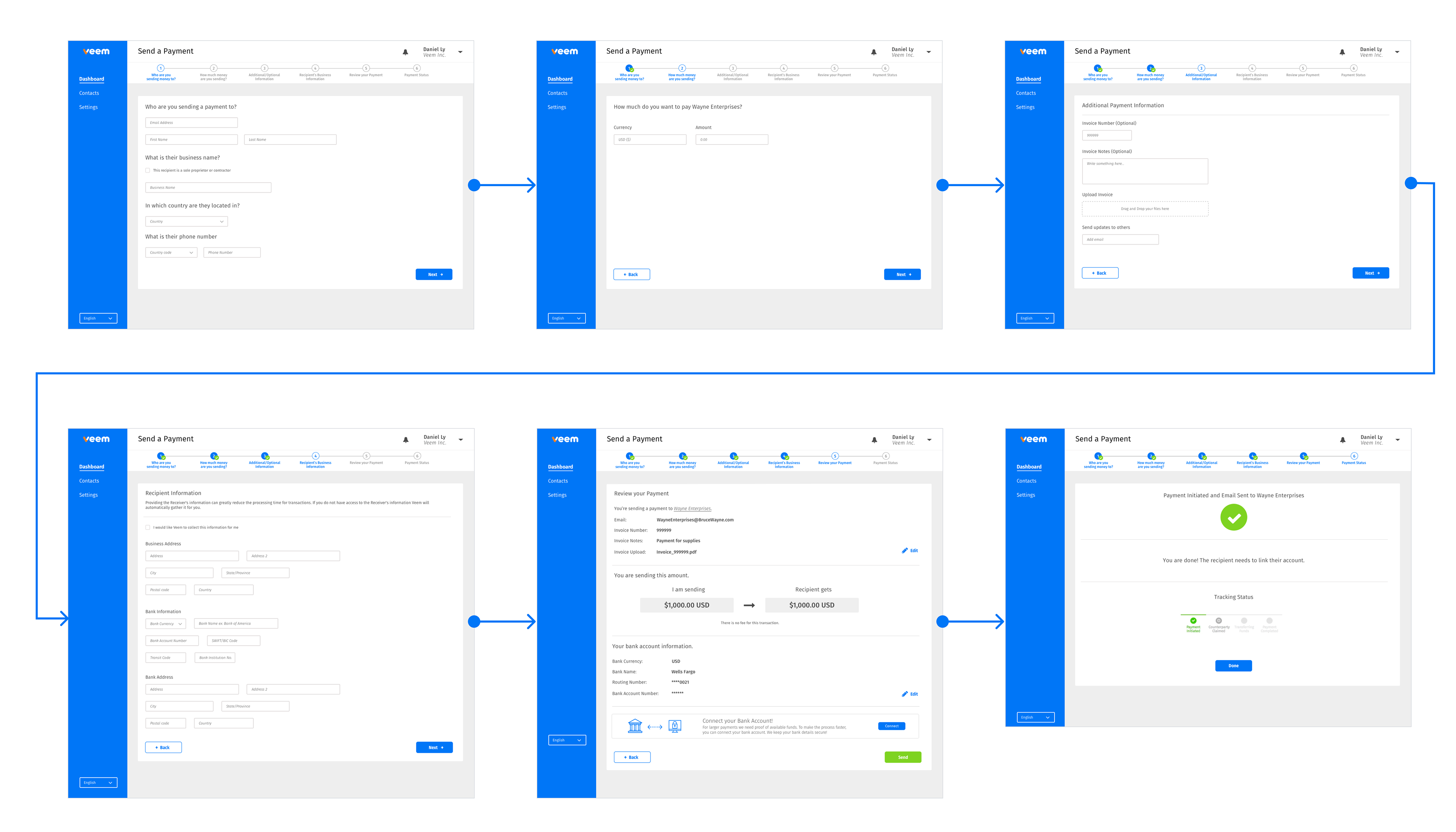
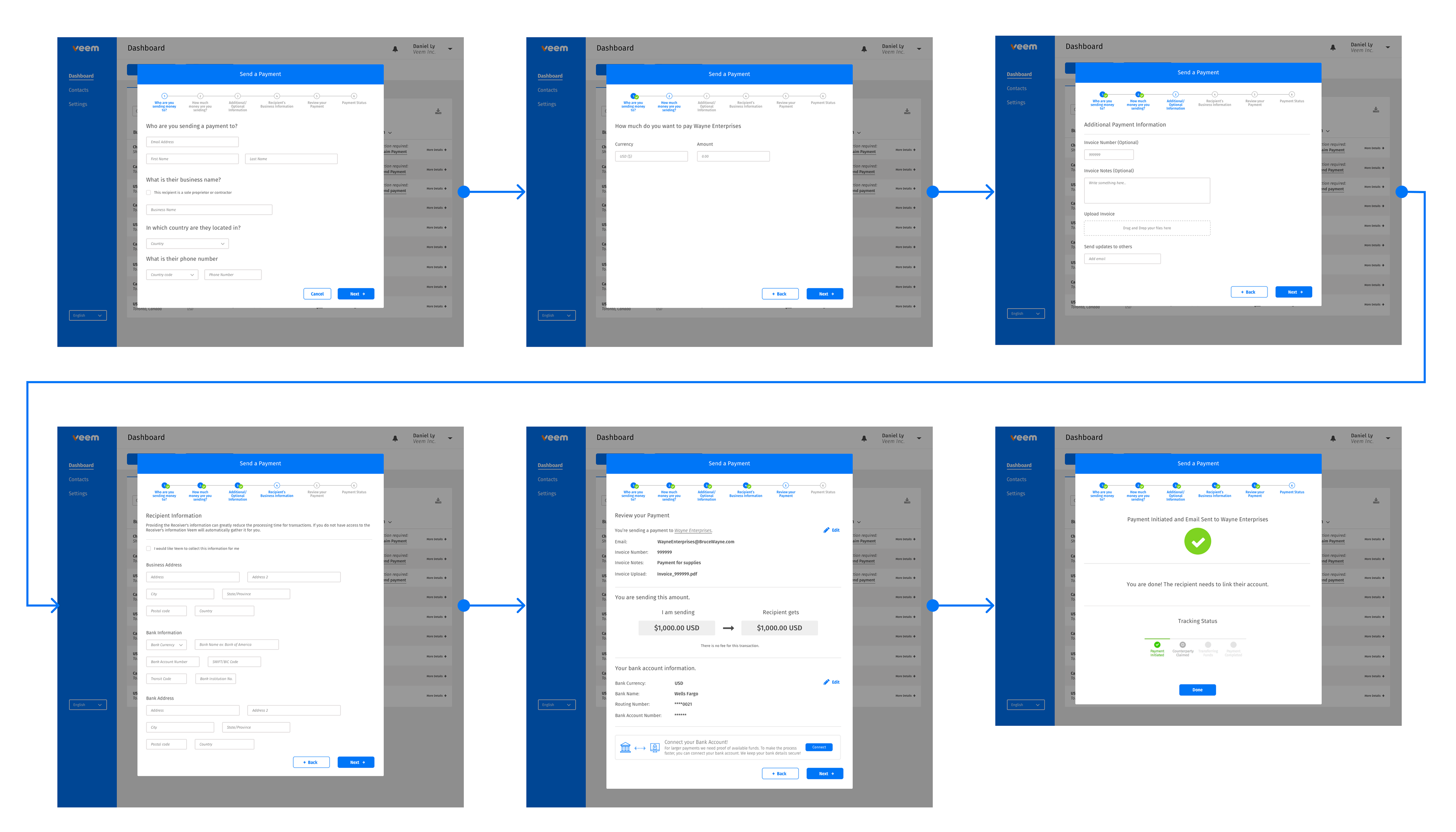
Version 1 - 6 steps full page
Although still 6 steps, we provide visibility with a progress bar, so user knows where they are and exactly how many steps are left. We also group the input fields so that the user can complete the flow faster.
Version 2 - 6 steps modal
Same user experience as Version 1, except in a modal
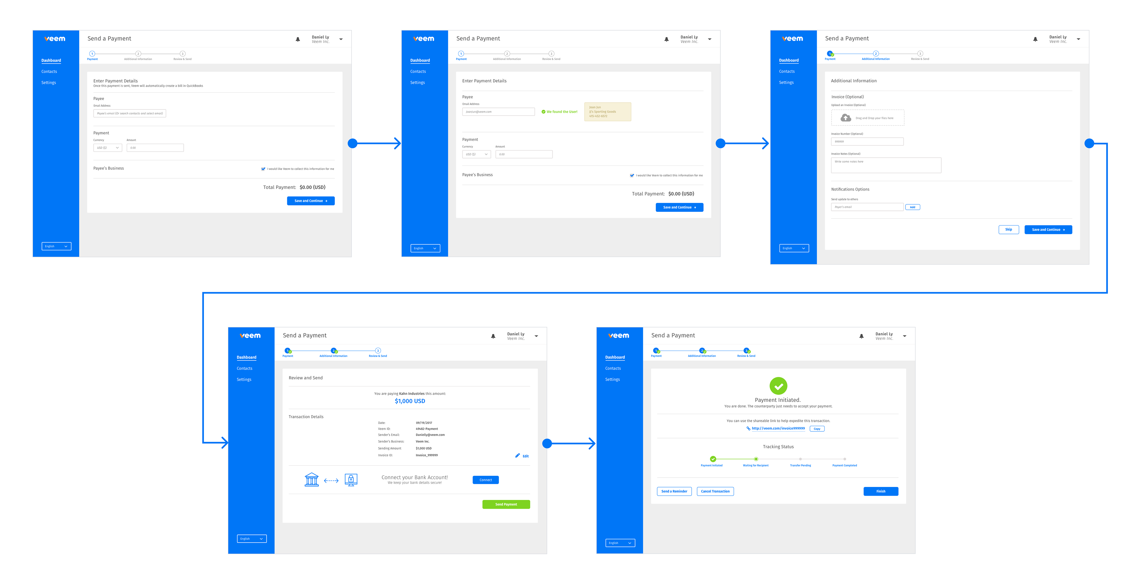
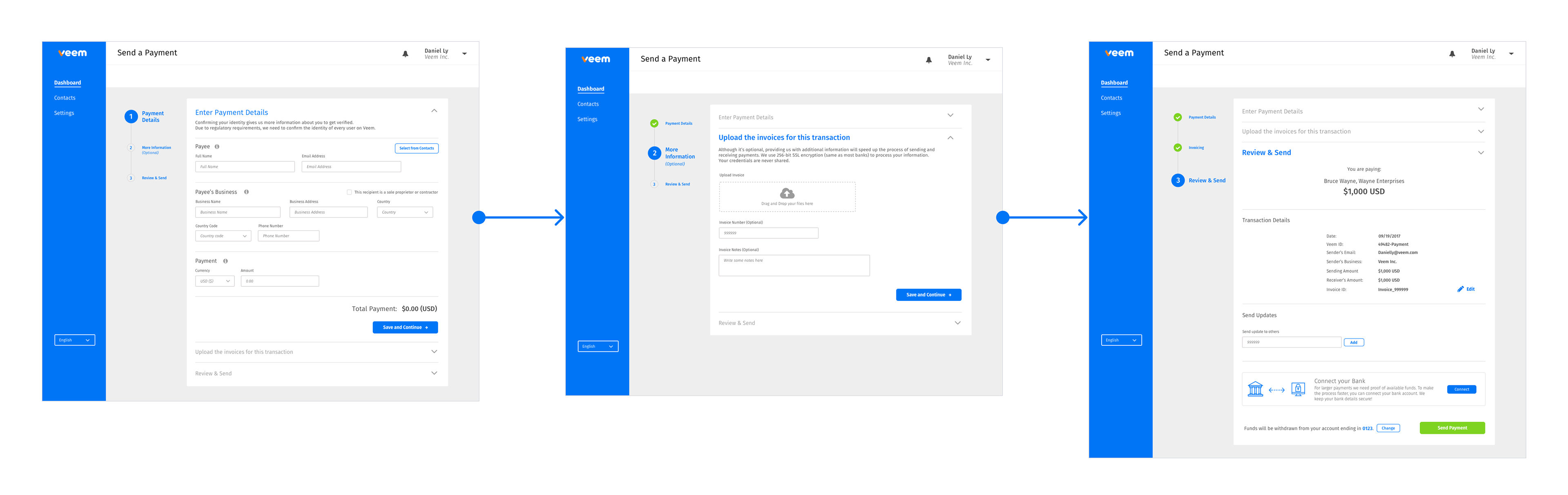
Version 3 - 3 steps condensed
We switched it up with a more vertical progress bar, and an accordion layout to reduce the overwhelming amount of input fields. At this stage with the help from Payments specialists and Product managers, we were guided to which input fields we could skip and were able to reduce the steps and get straight to sending the payment.
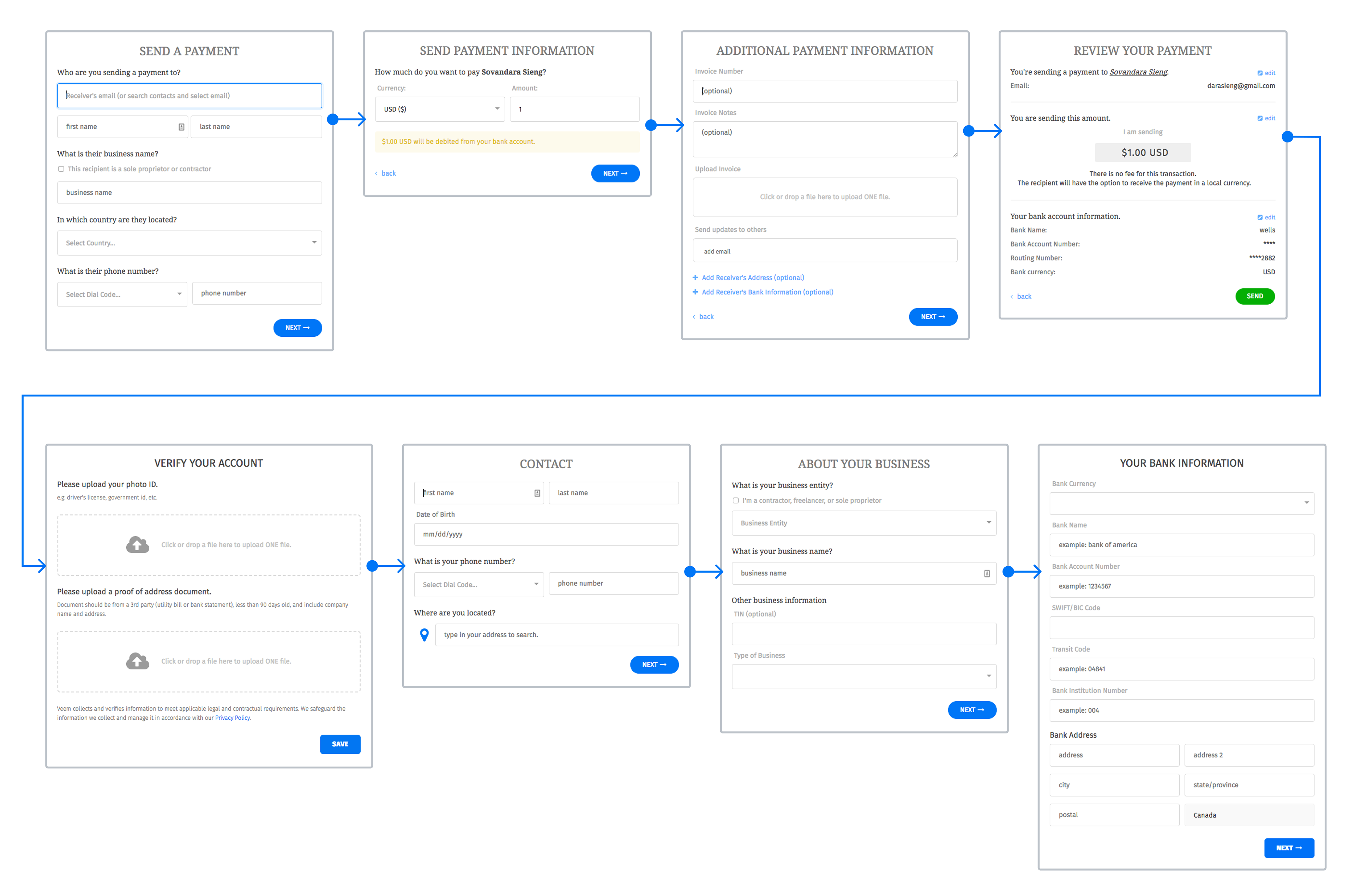
Final version
We were able to simplify even more input fields, with the goal of reducing friction. We then used our contact list, to search through Payee information.
We also decided that when you send a payment, that the Payee can complete the information on their end to be able to receive the payment, so that reduced a lot of input fields.