Competitive research/analysis


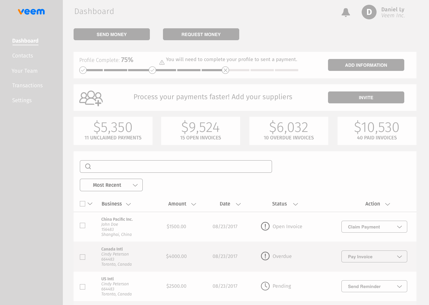
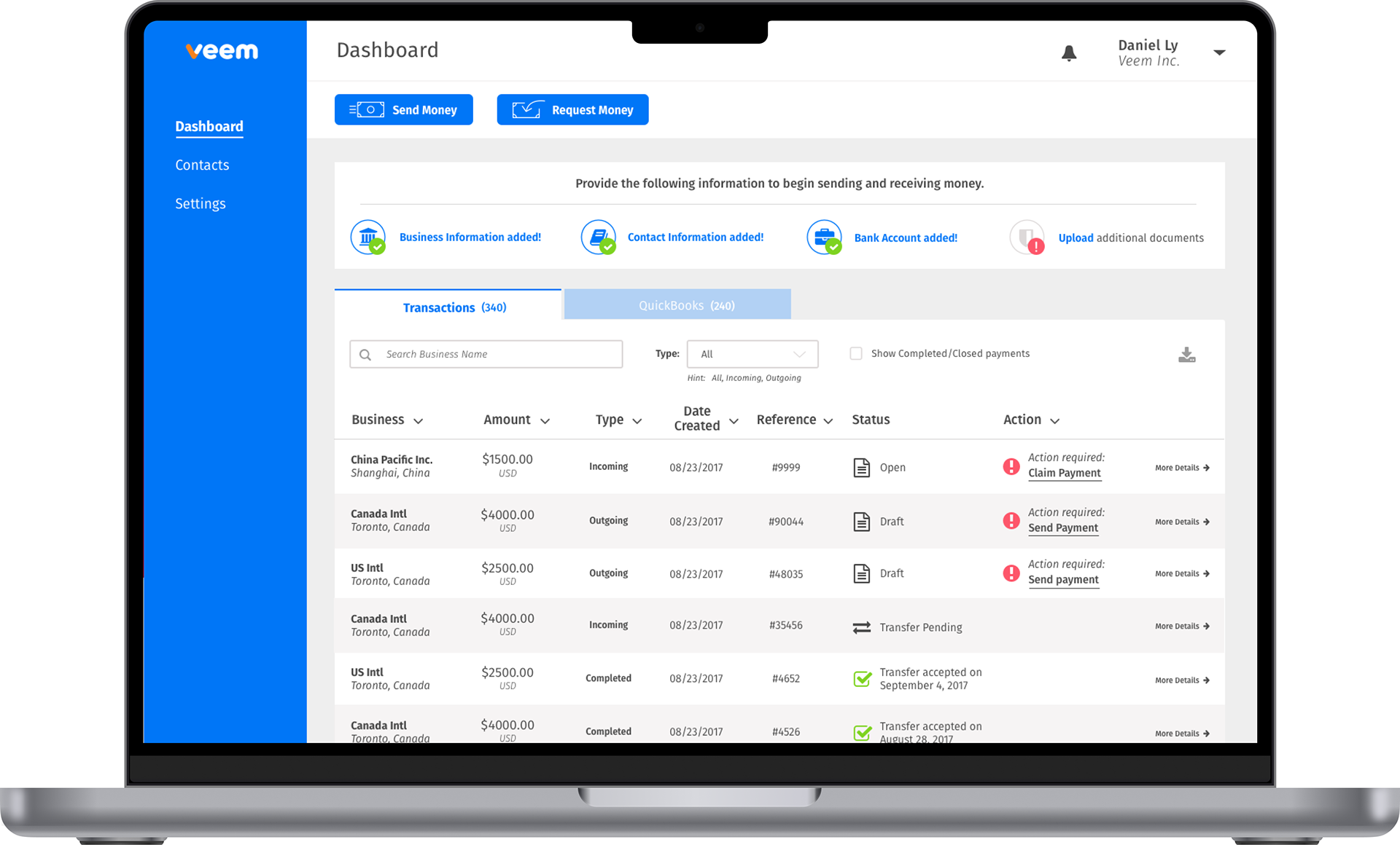
Old dashboard
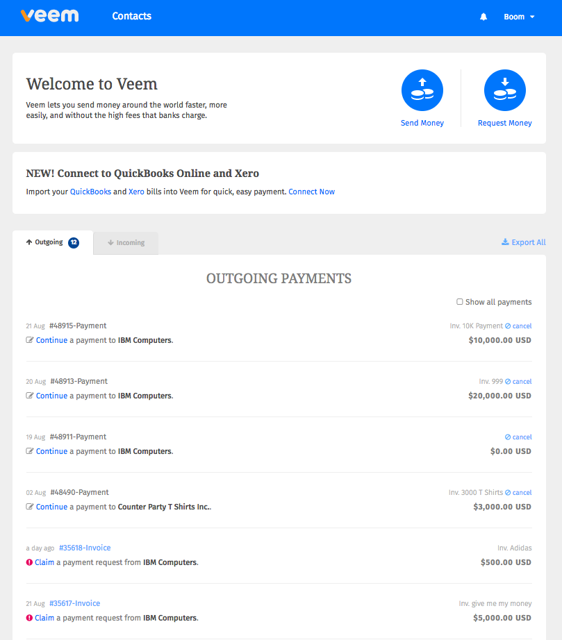
The problem
• Unclear what the user should do next
• Top-level navigation is hidden
• KYC is in settings hidden and without notifications
• As a dashboard, there is no useful information
• Outgoing/Incoming list organization and phrasing is not the way users see and want transactions to be organized
• Bad hierarchy on the transaction cards
• The transaction statuses are unclear and not prominent
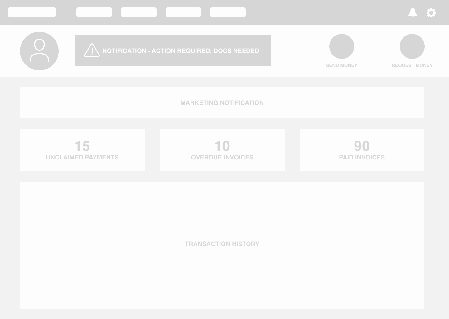
Discovery and exploration - Lo-fi - V1
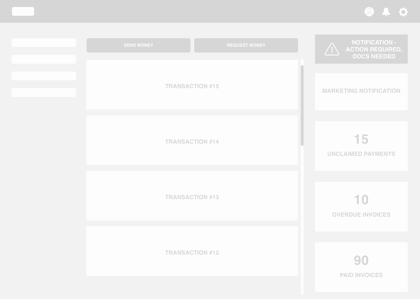
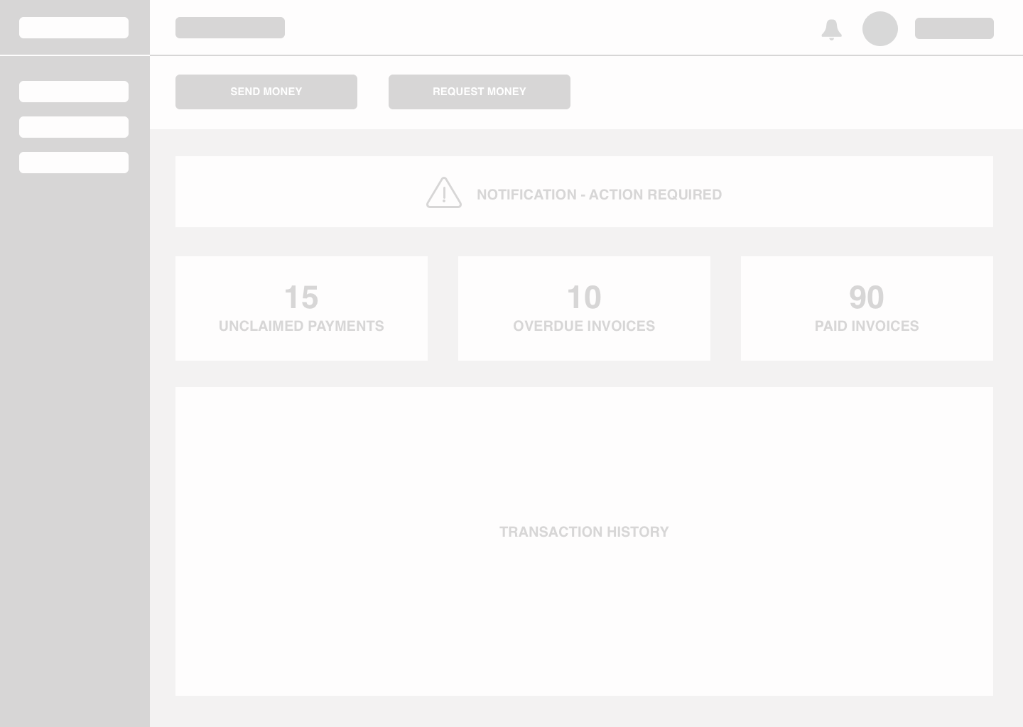
Discovery and exploration - Lo-fi - V2

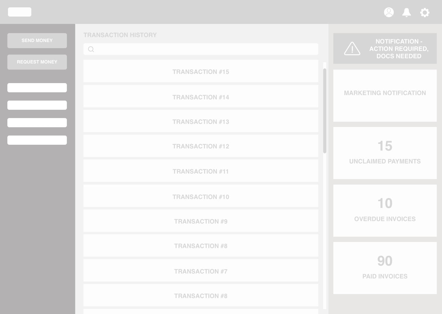
Discovery and color exploration
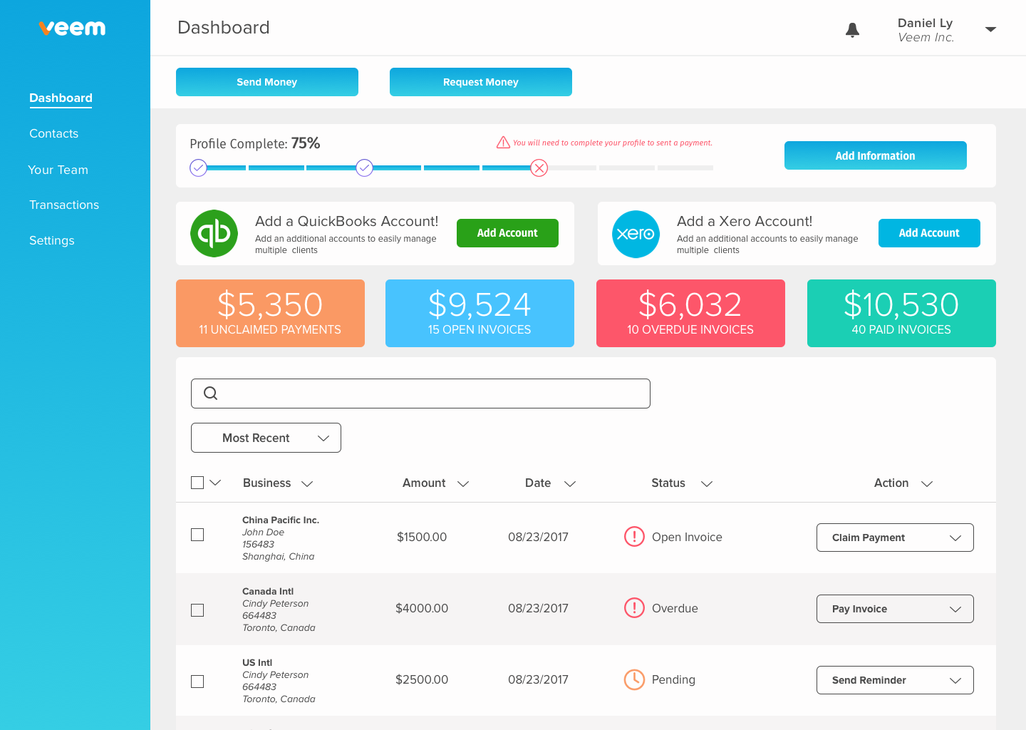
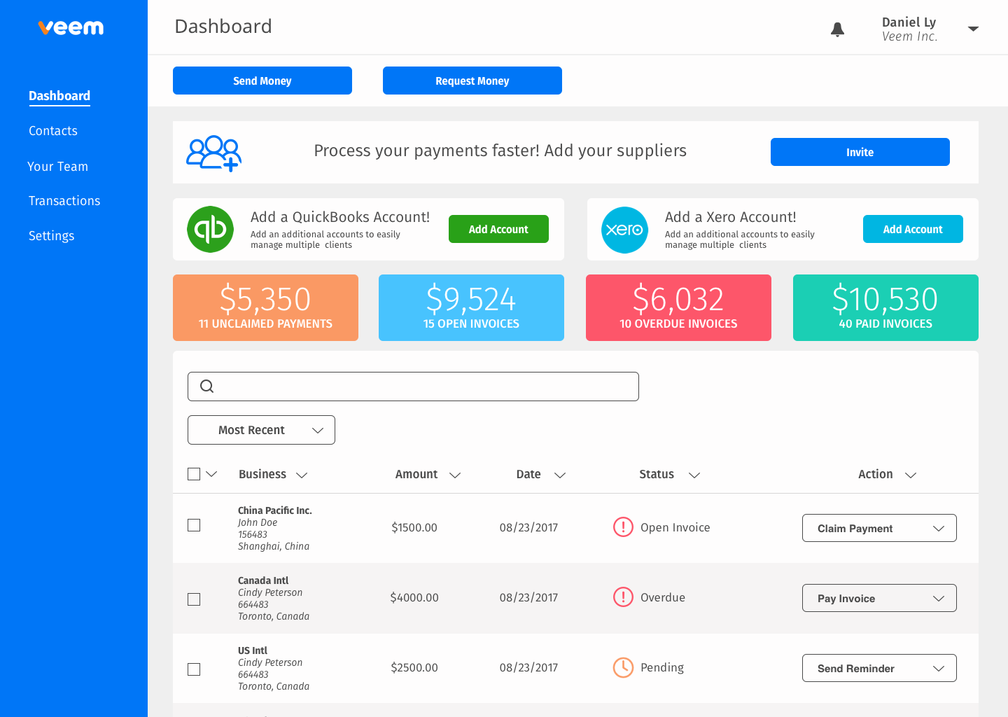
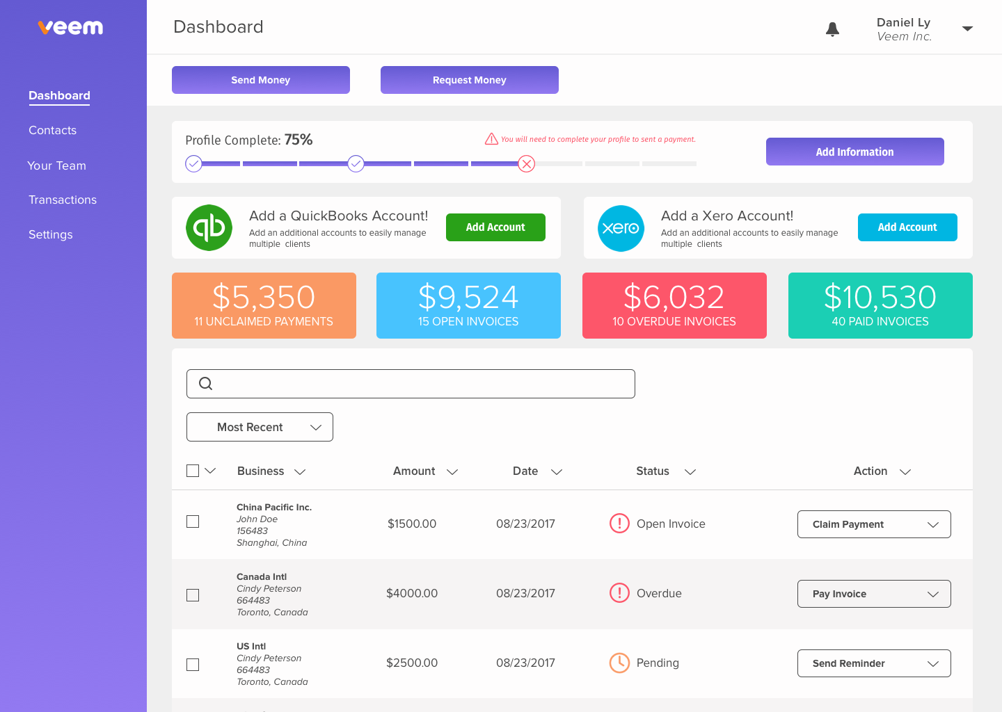
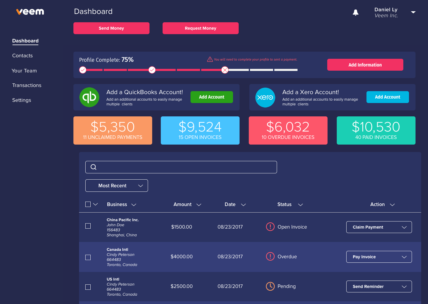
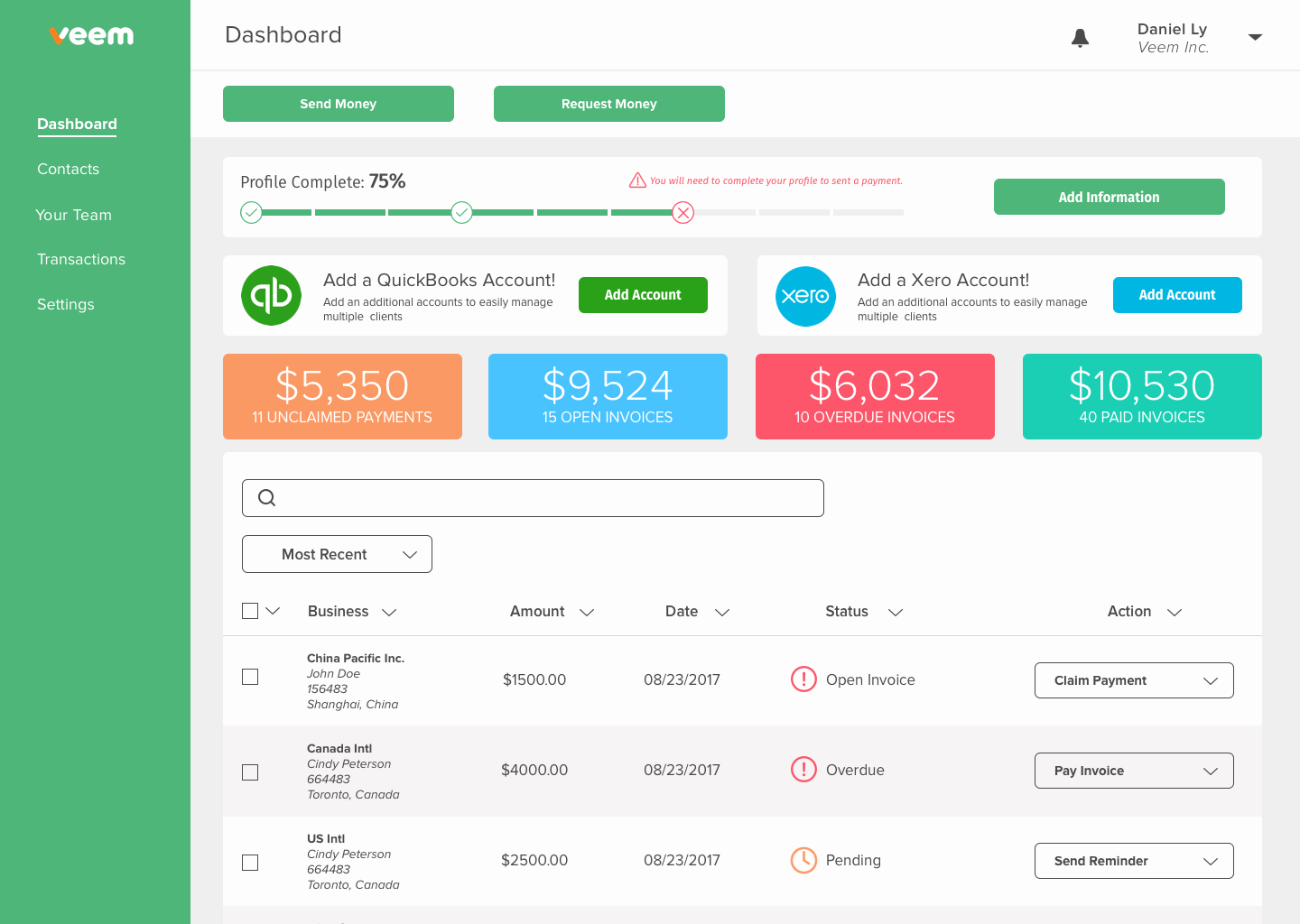

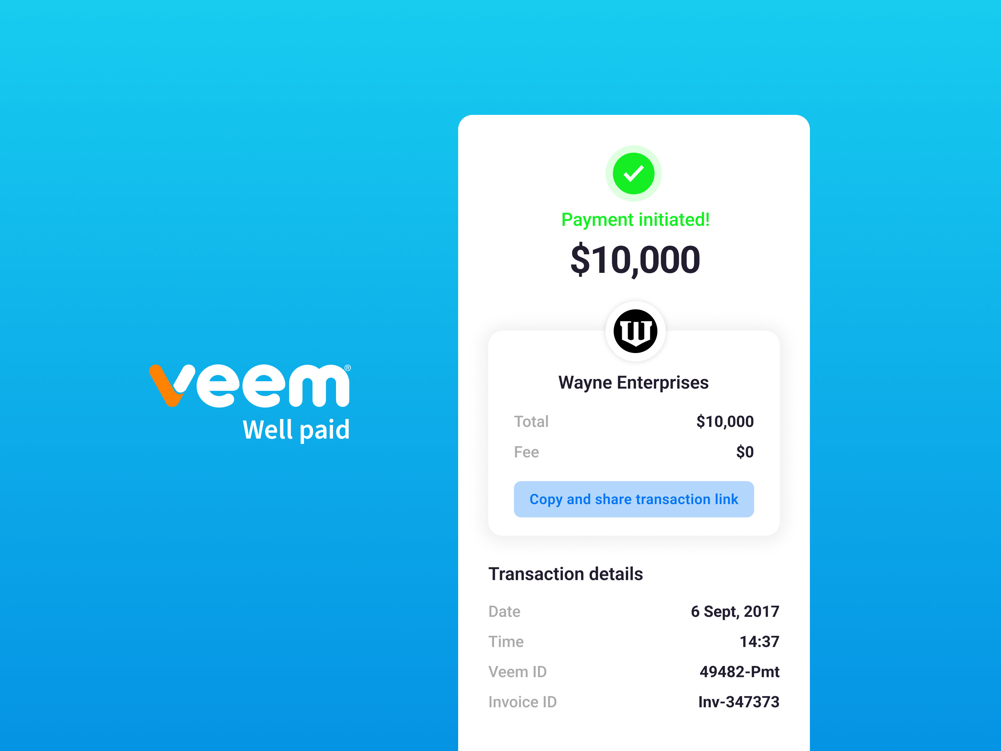
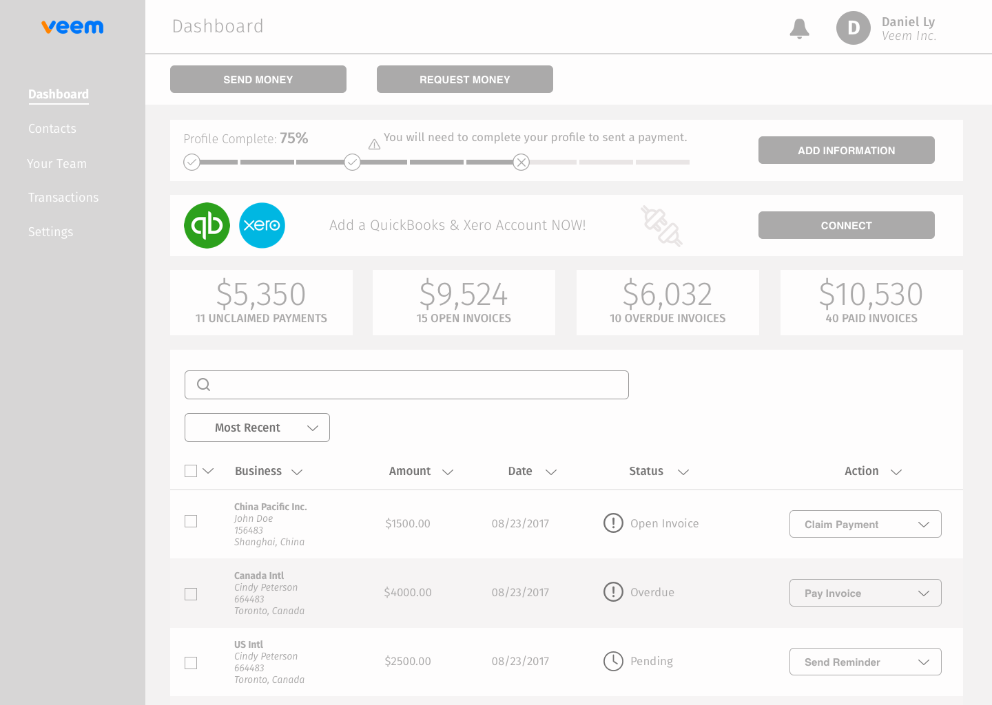
Final
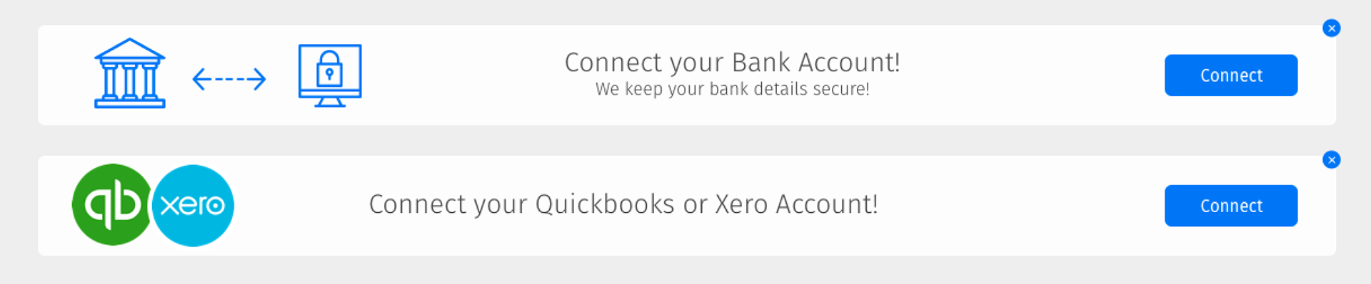
Banner callouts