Project Duration
8 Months
Company
Nauto
Role
Product Designer
User Interface, User experience (2024)

8 Months
Nauto
Product Designer
The current video player and surrounding interface feature multiple timelines with varying widths and playback markers, which leads to confusion and a high cognitive load for users. Additionally, the interior camera view is much smaller than the exterior view, which makes it difficult for users to clearly see certain event types, such as distractions.
The map, which visually indicates where the event took place, occupies a significant portion of the screen, yet doesn’t provide enough value to justify its space. We also support different media types for events, such as snapshots, videos, or no media at all. When events have no media, users often perceive this as a system bug.
There are inconsistencies in when IMU (Inertial Measurement Unit) data is displayed, leading users to interpret this as another issue with the system. Finally, the speedometer overlay on video content can obscure important visual information, affecting the clarity of the event being viewed.
Our AI is highly accurate/precise, which results in our system generating a lot of events.
This leads to two a couple user experience concerns:
The event feed becomes cluttered with a large number of events, many of which are irrelevant, requiring users to scroll through excess information.
From a LTE cost, Cloud/Infrastructure, it’s wasteful/cost inefficient.
Users have reported the amount of close proximity of events as potential bugs.

In Phase 1, we prioritized refining the video player experience. During this phase, we explored various ways to display IMU data more efficiently, aiming to reduce its screen space usage. We also focused on streamlining the video controls by consolidating them into a single, cohesive area. This included the current playback time, video length, save button, and volume toggle, all positioned for a more intuitive and unified user experience.
We made several design decisions to enhance the video viewing experience. To maintain clarity, we removed the speed overlay from the video, planning to relocate speed information to the details section in a future phase.
After refining the mobile video experience, we explored a vertically stacked layout for interior and exterior videos. Internal A/B testing confirmed that this approach allowed users to interpret events more quickly, making it the preferred option.
For IMU data, we evaluated multiple display options and decided to treat it as secondary information. Minimizing its presence and positioning it above the video player timeline was chosen to reduce cognitive load and streamline the interface.
Additionally, we chose to remove the map from the video viewing experience, as user feedback indicated that it did not add value in that context.
In Phase 2, we shifted our focus to enhancing the event details. We explored ways to visually integrate event information into the video viewing experience, drawing inspiration from automotive infotainment interfaces. One approach we considered was keeping event details in a bottom card, maintaining the top section as a dedicated, above-the-fold video viewing area.
Building on our previous decision to vertically stack videos, we also experimented with presenting event details in an accordion card format. This layout separates the video viewing experience on the left from the event details on the right, effectively reducing cognitive load and providing a more intuitive and efficient way for users to assess and understand the scene.

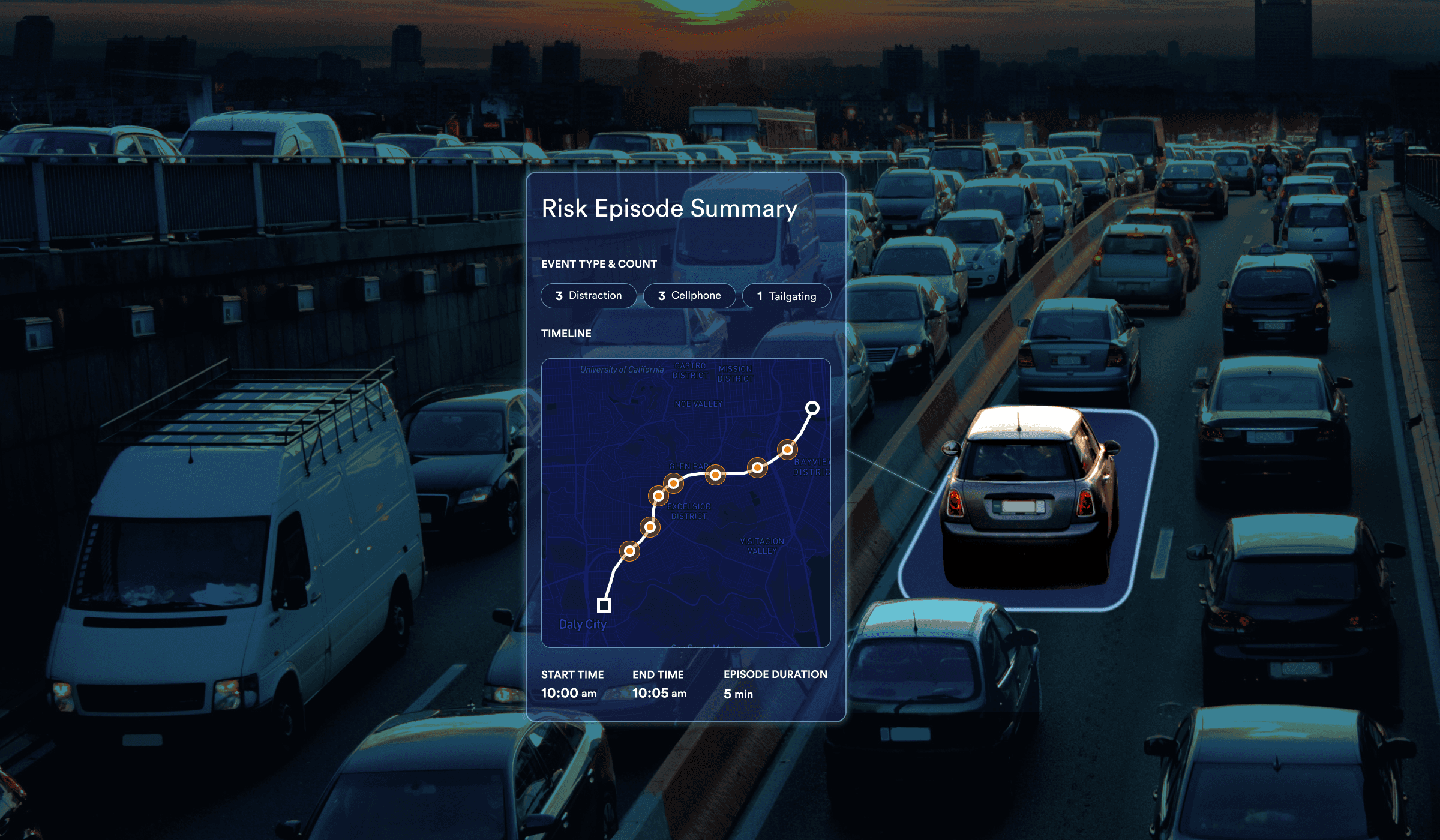
A risk episode, or multi-factor event, represents a cluster of individual events—including combo events—that occur within a broader, defined time frame. While the exact duration of this time window is still under consideration, it is preliminarily estimated to range between 5 seconds and 1.5 minutes. This approach provides a more holistic view of high-risk driving behaviors by capturing patterns and correlations that extend beyond isolated incidents.

For the episode summary, we opted for a full-width card to emphasize the timeline of multiple events and highlight their close proximity. In this design phase, we decided to feature only one piece of media to represent the episode. Including media for each event could be overwhelming and might also reintroduce the perception of system bugs, especially if some events lack media.
All event details are organized on the left within an accordion card. If certain information is unavailable, a dash is displayed to maintain consistency.
Speedometer data is also included in the accordion card and appears in red when the speed exceeds the posted limit. Additionally, the map is positioned under the event details heading within the accordion for a cleaner and more focused layout.
Trip details now feature the date, total distance, total time, and locations, providing users with a comprehensive overview.
Looking ahead to the next phase, we have a few open questions:
Does presenting a single piece of media effectively convey the full context of the episode?
Are there certain risk episode sequences that are more riskier than others?
Increased views on events
Improved driver safety scores